
FINFO booklets
Concept and visual design
FINFO booklets are printed publications that showcase Finland’s key strengths. They are part of Finland’s country-branding and are published by the Ministry for Foreign Affairs of Finland.
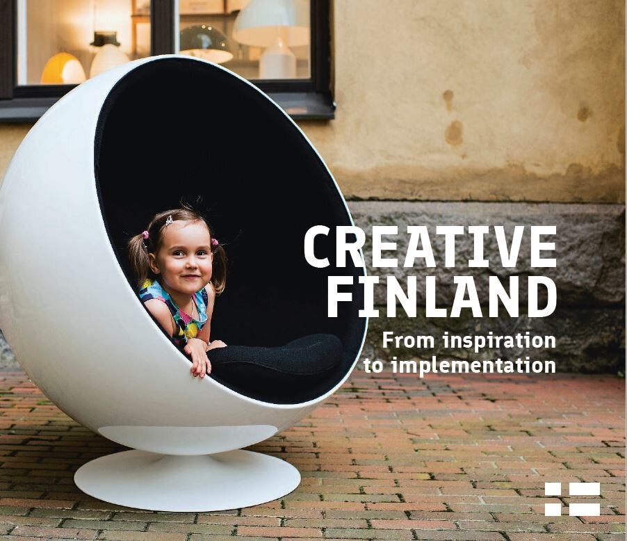
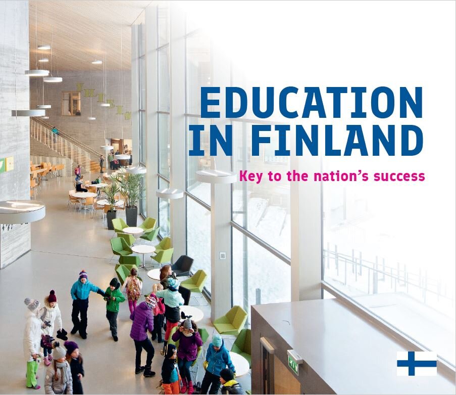
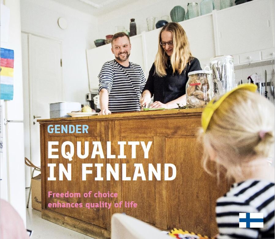
In 2016 the client brief was to design a standard concept for the FINFO brochure series, which at that time consisted of publications with different content types in different document sizes. The publication family needed to have a more consistent identity, both content-wise and visually. Every publication had it's own main theme, which can vary from food and culture to education and gender equality. Therefore, the publication needed to be recognisible.
The most challenging part of the project was the large amount of language versions that were needed. Each FINFO booklet had approximately 10 language versions, which I had to consider when designing and planning the layouts, typography, content, pictures and infographics. As an example, the FINFO - Education in Finland edition was published in Arabic, Chinese, English, French, German, Japanese, Portuguese, Russian and Spanish. The look and feel needed to stay the same, when the text was shorter or longer depending on what the language was - or when the writing system is a lot different and read from right to left. The multicultural nature of the project also had an impact on the images we could use.
The project also made me familiar with the Middle East and North African edition of InDesign, which was fun and interesting.
I was privileged to design and work with the following FINFO booklets:
